
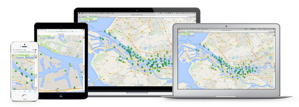
What is WEBSUITE?
Websuite is an online dashboard representation tool for eNose data. This management information system for online air quality monitoring is designed to be user friendly and is engineered to display and visualise all acquired eNose data to get complete insights in the rise and spread of gas emissions. Websuite also offers a set of tools for data analysis, emissions source tracking, emissions plume dispersion tracing and finger print entry.
How does it work?
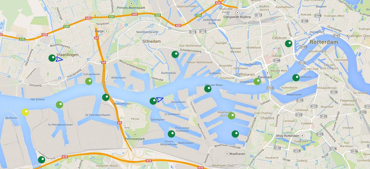
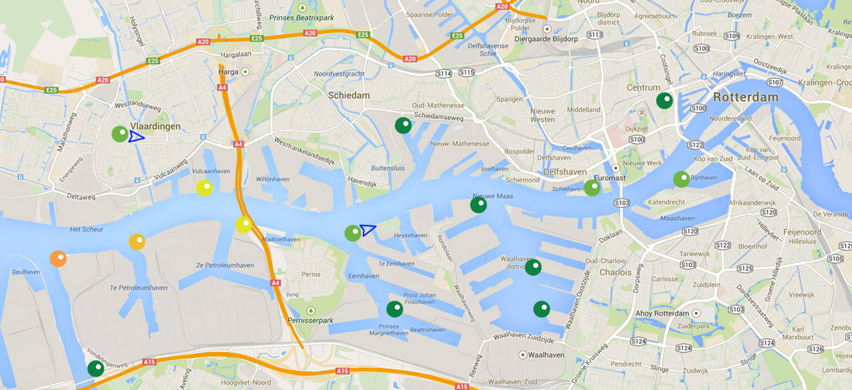
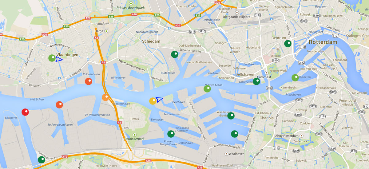
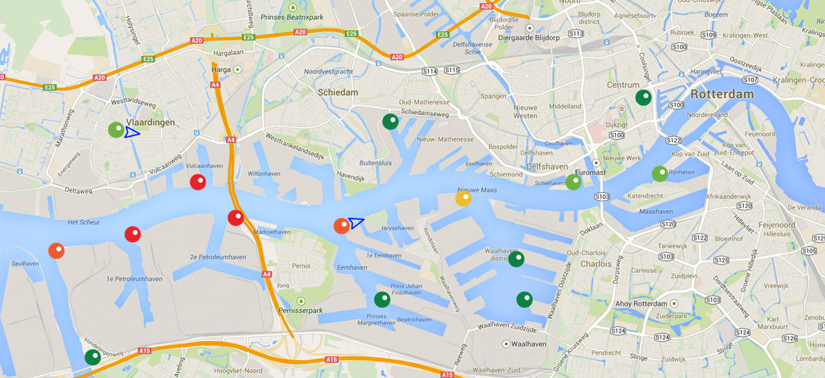
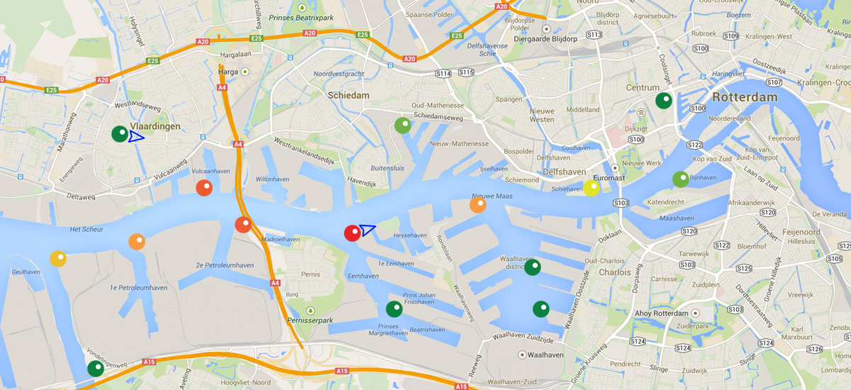
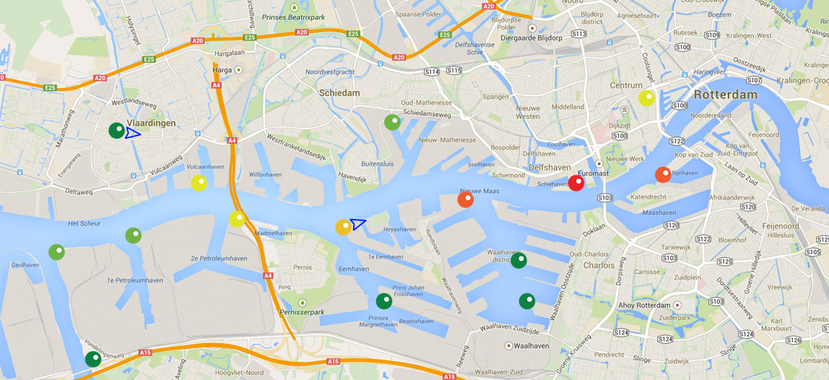
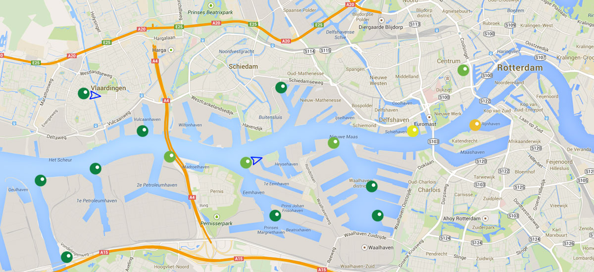
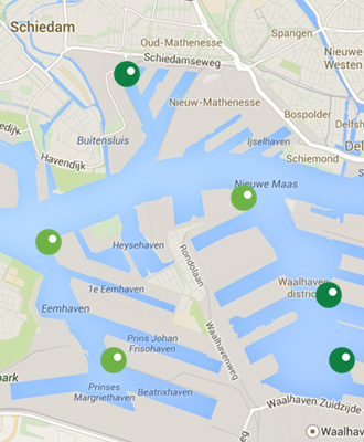
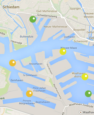
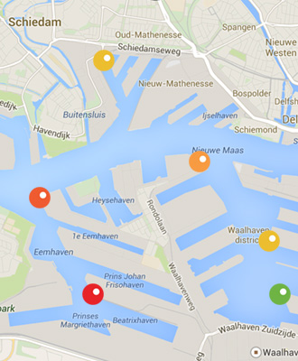
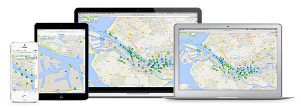
The Websuite dashboard is a web-based user interface that displays both the actual and historical status of eNoses in the eNose network. Each eNose is displayed by means of a coloured dot on a GIS map. The colour of the dot gives an indication of the air composition detected by the eNose. The colours range from Green-Yellow-Orange-Red.


Green = normal atmospheric situation, normal trace gas concentration in ambient air
Yellow = small increase of the trace gas concentration in ambient air
Orange = clear increase of the trace gas concentration in ambient air
Red = considerable increase of the trace gas concentration in ambient air, unusual air composition
This visual traffic light indication can be combined with an alert signal if the eNose status changes to a pre-set alert level situation. The threshold values for the traffic light colour range are defined in cooperation with the client. The definition of the threshold value is based on the location of the eNose (industrial or residential) and the accompanied risks or odour nuisance at certain signal levels. This function applied in combination with meteorological data results in a clear picture of the rise and spread of gas emissions and serves as an early warning tool in gas emission management.
The plot below depicts a fictive eNose network displayed in the Websuite dashboard. Each dot represents an eNose. The animation shows a plume passing across the area.


Graphical display eNose data
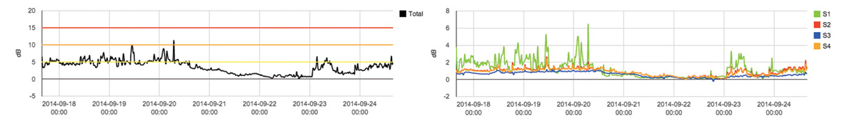
Via the Websuite clients have access to all their eNose data, which is accessible 24/7. Besides the representation on a GIS map, eNose data can be graphically displayed. Each eNose can be analysed separately and anomalous peaks in the eNose registrations of the air composition can be identified.
Additional data analysis tools
We are constantly developing new eNose data representation tools for better and easier data interpretation to make Websuite even better!
Currently we can offer:
- Windrose tool for emissions source tracing
- Research tool for plume dispersion tracking and pattern recognition
- Emission – Receptor relation tool
- Degassing Vessel Detective
- HAZMAT tool
- OdourApp (iOS/Android) – mobile app for registration of human odour perceptions
Benefits of Websuite
- Real-time insights in the rise and spread of odorous and non-odorous emissions
- Early-warning system in case of odour nuisance & safety events
- Fast indication of the release of hazardous and annoying emissions
- Alerts when air quality is unusual
- Automatic odour alerts
- Gives good indication of historical & actual air composition
- Accessible 24/7
- Downloadable eNose graphs in picture format
- Web-based, compatible with PC, tablet and smartphone
- Data-analysis tools for better data interpretation
WEBSUITE
LOG IN
What is Websuite?
Websuite is an online dashboard representation tool for eNose data. This management information system for online air quality monitoring is designed to be user friendly and is engineered to display and visualise all acquired eNose data to get complete insights in the rise and spread of gas emissions. Websuite also offers a set of tools for data analysis, emissions source tracking, emissions plume dispersion tracing and finger print entry.
How does it work?
The Websuite dashboard is a web-based user interface that displays both the actual and historical status of eNoses in the eNose network. Each eNose is displayed by means of a coloured dot on a GIS map. The colour of the dot gives an indication of the air composition detected by the eNose. The colours range from Green-Yellow-Orange-Red.
Green = normal atmospheric situation, normal trace gas concentration in ambient air
Yellow = small increase of the trace gas concentration in ambient air
Orange = clear increase of the trace gas concentration in ambient air
Red = considerable increase of the trace gas concentration in ambient air, unusual air composition
This visual traffic light indication can be combined with an alert signal if the eNose status changes to a pre-set alert level situation. The threshold values for the traffic light colour range are defined in cooperation with the client. The definition of the threshold value is based on the location of the eNose (industrial or residential) and the accompanied risks or odour nuisance at certain signal levels. This function applied in combination with meteorological data results in a clear picture of the rise and spread of gas emissions and serves as an early warning tool in gas emission management.
The plot below depicts a fictive eNose network displayed in the Websuite dashboard. Each dot represents an eNose. The animation shows a plume passing across the area.
Graphical display eNose data
Via the Websuite clients have access to all their eNose data, which is accessible 24/7. Besides the representation on a GIS map, eNose data can be graphically displayed. Each eNose can be analysed separately and anomalous peaks in the eNose registrations of the air composition can be identified.
Additional data analysis tools
We are constantly developing new eNose data representation tools for better and easier data interpretation to make Websuite even better!
Currently we can offer:
• Windrose tool for emissions source tracing
• Research tool for plume dispersion tracking and pattern recognition
• Emission – Receptor relation tool
Benefits of Websuite
- Real-time insights in the rise and spread of odorous and non-odorous emissions
- Early-warning system in case of odour nuisance & safety events
- Fast indication of the release of hazardous and annoying emissions
- Alerts when air quality is unusual
- Automatic odour alerts
- Gives good indication of historical & actual air composition
- Accessible 24/7
- Downloadable eNose data in Excel and graphs in picture format
- Web-based, compatible with PC, tablet and smartphone
- Data-analysis tools for better data interpretation
What is WEBSUITE?
Websuite is an online dashboard representation tool for eNose data. This management information system for online air quality monitoring is designed to be user friendly and is engineered to display and visualise all acquired eNose data to get complete insights in the rise and spread of gas emissions. Websuite also offers a set of tools for data analysis, emissions source tracking, emissions plume dispersion tracing and finger print entry.
How does it work?
The Websuite dashboard is a web-based user interface that displays both the actual and historical status of eNoses in the eNose network. Each eNose is displayed by means of a coloured dot on a GIS map. The colour of the dot gives an indication of the air composition detected by the eNose. The colours range from Green-Yellow-Orange-Red.
Green = normal atmospheric situation, normal trace gas concentration in ambient air
Yellow = small increase of the trace gas concentration in ambient air
Orange = clear increase of the trace gas concentration in ambient air
Red = considerable increase of the trace gas concentration in ambient air, unusual air composition
This visual traffic light indication can be combined with an alert signal if the eNose status changes to a pre-set alert level situation. The threshold values for the traffic light colour range are defined in cooperation with the client. The definition of the threshold value is based on the location of the eNose (industrial or residential) and the accompanied risks or odour nuisance at certain signal levels. This function applied in combination with meteorological data results in a clear picture of the rise and spread of gas emissions and serves as an early warning tool in gas emission management.
The plot below depicts a fictive eNose network displayed in the Websuite dashboard. Each dot represents an eNose. The animation shows a plume passing across the area.
Graphical display eNose data
Via the Websuite clients have access to all their eNose data, which is accessible 24/7. Besides the representation on a GIS map, eNose data can be graphically displayed. Each eNose can be analysed separately and anomalous peaks in the eNose registrations of the air composition can be identified.
Additional data analysis tools
We are constantly developing new eNose data representation tools for better and easier data interpretation to make Websuite even better!
Currently we can offer:
- Windrose tool for emissions source tracing
- Research tool for plume dispersion tracking and pattern recognition
- Emission – Receptor relation tool
- Degassing Vessel Detecive
- HAZMAT tool
- OdourApp (iOS/Android) – mobile app for registration of human odour perceptions
Benefits of Websuite
- Real-time insights in the rise and spread of odorous and non-odorous emissions
- Early-warning system in case of odour nuisance & safety events
- Fast indication of the release of hazardous and annoying emissions
- Alerts when air quality is unusual
- Automatic odour alerts
- Gives good indication of historical & actual air composition
- Accessible 24/7
- Downloadable eNose graphs in picture format
- Web-based, compatible with PC, tablet and smartphone
- Data-analysis tools for better data interpretation